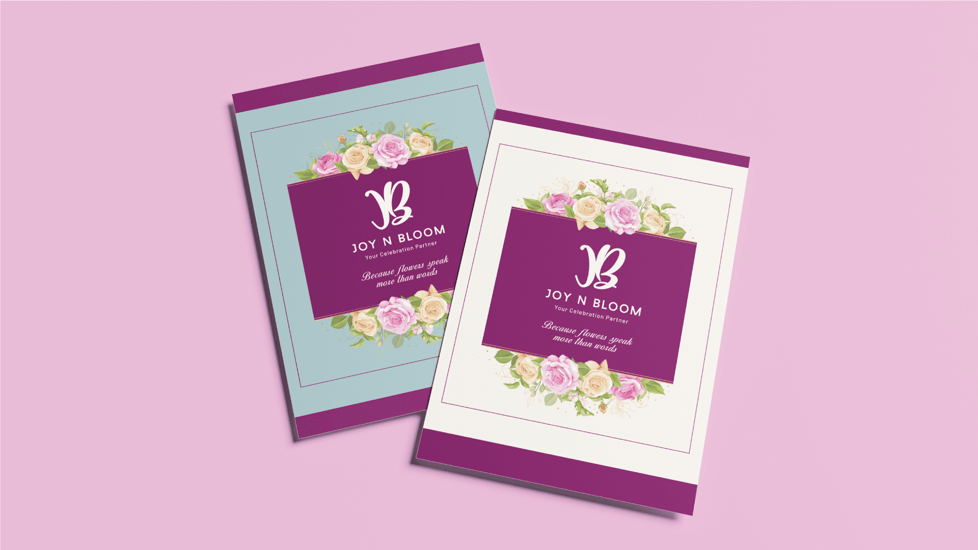
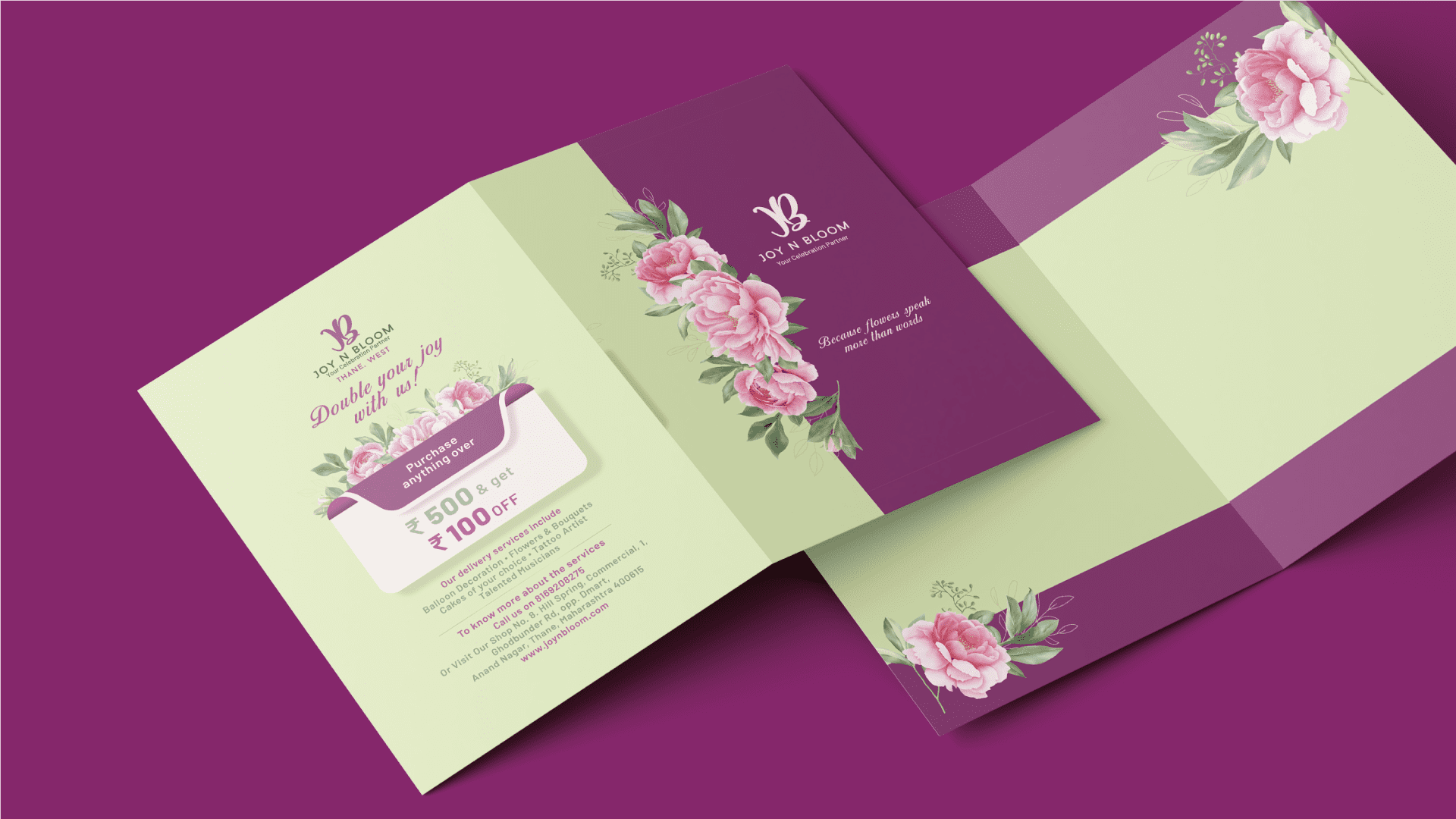
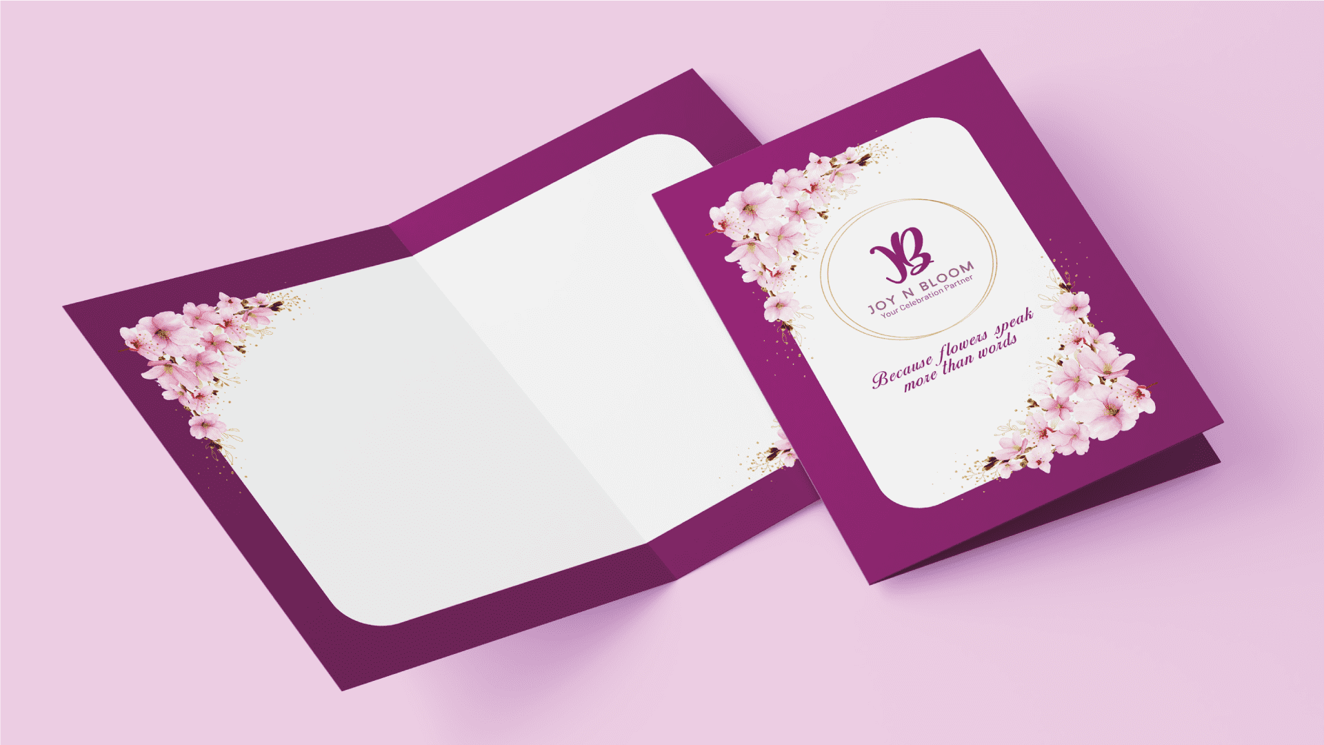
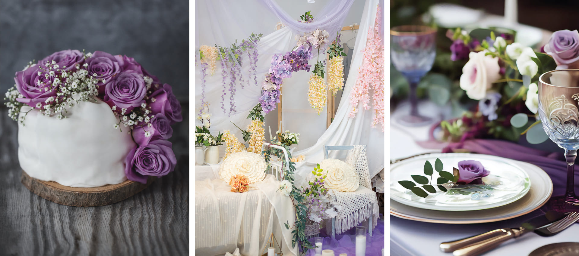
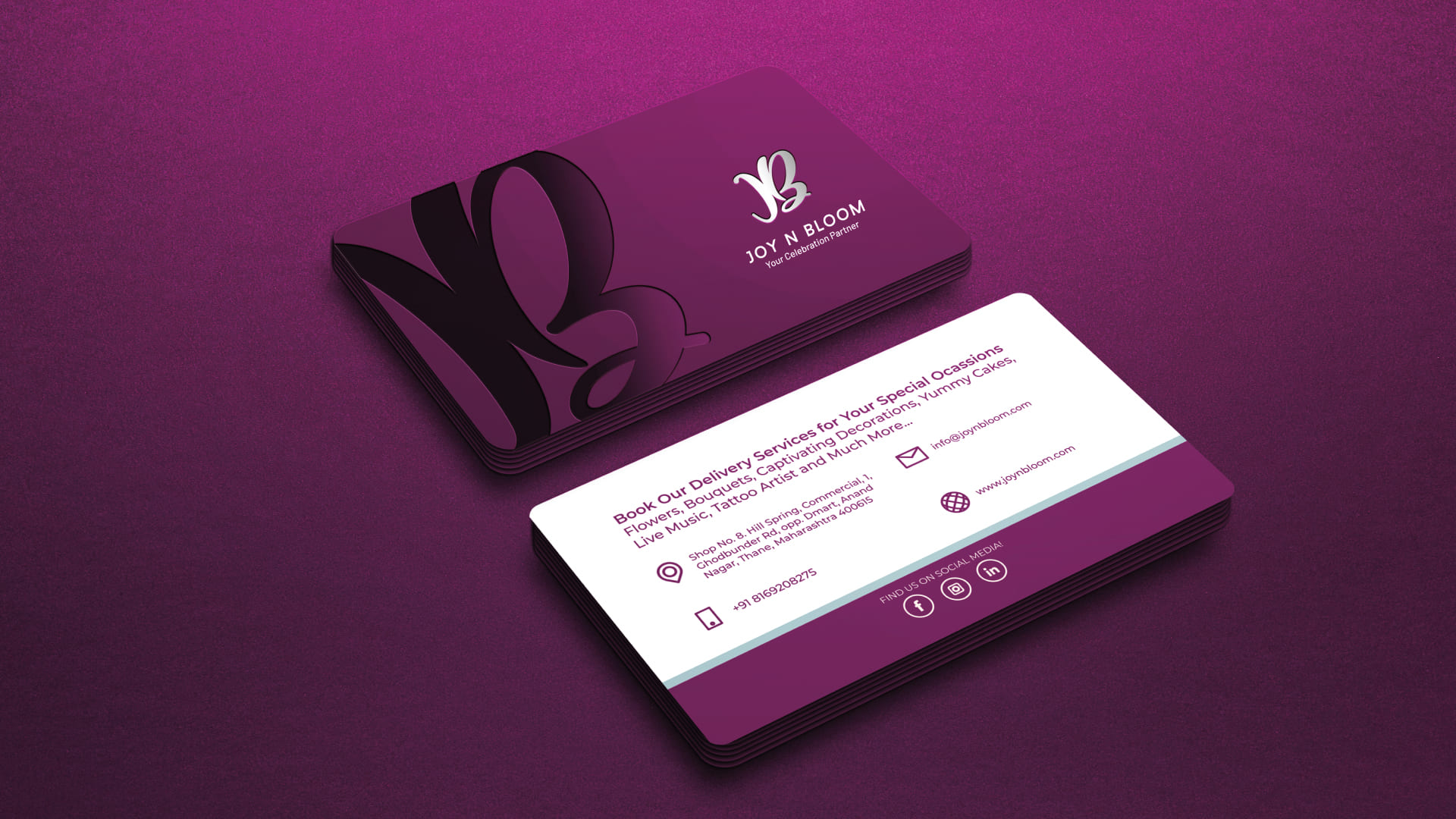
We carefully selected a vibrant yet subtle color palette that perfectly complemented the brand’s offerings. These colors were chosen to evoke a sense of joy, excitement, and elegance. By using a harmonious blend of vibrant and subdued shades, we created a visually captivating experience that reflected the brand’s vibrant spirit while maintaining an element of sophistication.
The chosen colors were applied consistently across various brand elements, including the logo, marketing collaterals, and digital assets. This ensured a cohesive and unified brand presence that resonated with customers and conveyed the brand’s unique personality.
The vibrant yet subtle colors not only enhanced the overall aesthetic appeal of Joy n Boom’s visual identity but also served to grab attention and leave a lasting impression on customers. By carefully selecting these colors, we were able to showcase the brand’s beauty and celebrate the joyous nature of its offerings.
The result was a visual brand identity that captured the essence of Joy n Boom, effectively communicating the brand’s vibrancy and enhancing its overall appeal. Our choice of vibrant yet subtle colors played a crucial role in creating a memorable and visually stunning experience for customers, elevating the brand and setting it apart in the market.
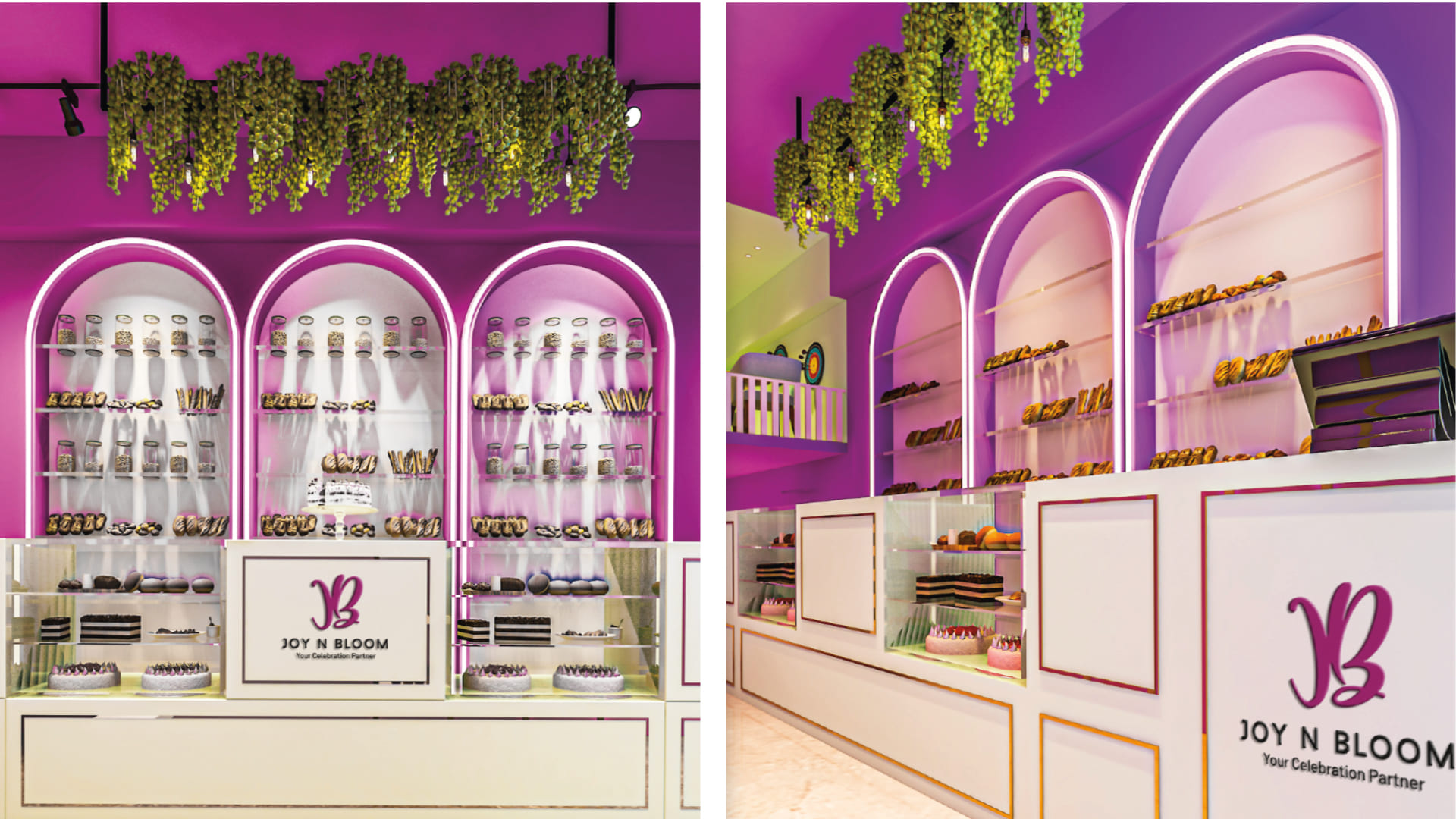
The cohesive integration of the vibrant yet subtle color palette throughout the shop’s interior design elevated the brand’s presence and left a lasting impression on customers. It reinforced the brand’s identity, enhanced the overall brand experience, and solidified Joy n Boom’s position as a destination for celebrating special moments in style.
Interior Design By:
Ar. Sailee Chaudhari,
The Room of Elements.

